Few words about Style Guide
A style guide is a document gathering all elements of your brand’s visual style. A style guide is a “one-stop place for the entire team—from product owners and producers to designers and developers—to reference when discussing site changes and iterations.”
Generally, the style guide is useful for the following functions:
Consistency.
A unified visual experience is one of the main qualities of brand identity that helps you create a trustful relationship with your audience.
Shared vocabulary.
When all your team members have one document they can refer to, the work really becomes collaborative.
Onboarding.
New designers can be involved in making design decisions from the very first day and don’t have to constantly bug older employees.
Code standardization.
UI style guides help create consistent HTML, CSS, and JavaScript code so front-end developers can follow the same standards designers do.
Important: Don’t confuse a style guide with a brand guide. A brand style, AKA brand guidelines, is a document listing correct usage of a brand’s logos, icons, names, and sometimes even sounds. Most companies post their brand styles for marketing and PR purposes.
Below let’s overview our internal Style Guide structure:
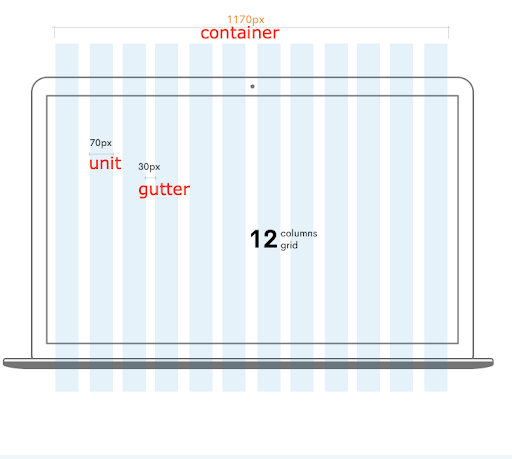
Grid setup
UI designers use lines, columns, and margins to create the backbone of a web page. Every web page designing process starts with a grid. So, setting a grid policy will ensure that all pages have the same proportions and component alignment.
To set up a grid you will need to take in consideration certain mandatory aspects like container, units, number of rows and columns, margins and gutter. Developers are mainly interested in the functionality of the product, so all your elements need to be placed properly, without affecting the layout.
A basic grid system consists of:
Units. Building blocks of a grid.
Gutter. Whitespace that separates units. These are thin white vertical lines.
Column or container. Blocks of interface comprised of several units and gutters.
Responsive Layouts
When digital products are designed around responsive grid systems, UI Style Guides must address interface layouts across screen sizes. Different column sizes automatically change dimensions once they reach certain breakpoints. To illustrate, resize your browser window and you will see the grid columns change size.
| Extra small <320px |
Small ≥576px |
Medium ≥768px |
Large ≥992px |
Extra large ≥1200px |
|
| .container | 100% | 540px | 720px | 960px | 1140px |
| .container-sm | 100% | 540px | 720px | 960px | 1140px |
| .container-md | 100% | 100% | 720px | 960px | 1140px |
| .container-lg | 100% | 100% | 100% | 960px | 1140px |
| .container-xl | 100% | 100% | 100% | 100% | 1140px |
| .container-fluid | 100% | 100% | 100% | 100% | 100% |
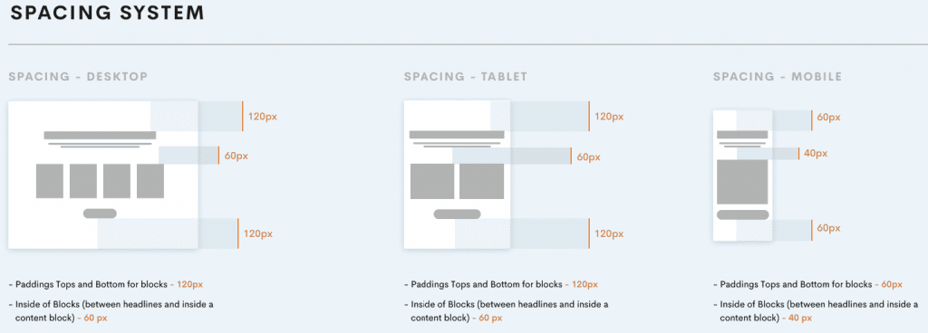
Spacing system
Spacing helps content to breathe as well as create hierarchy and depth. It ensures optimal readability and space efficiency.
Spacing is about giving every piece of content its own space on the screen. We use margin and padding to keep content separated from other elements such as images, video embeds and text.
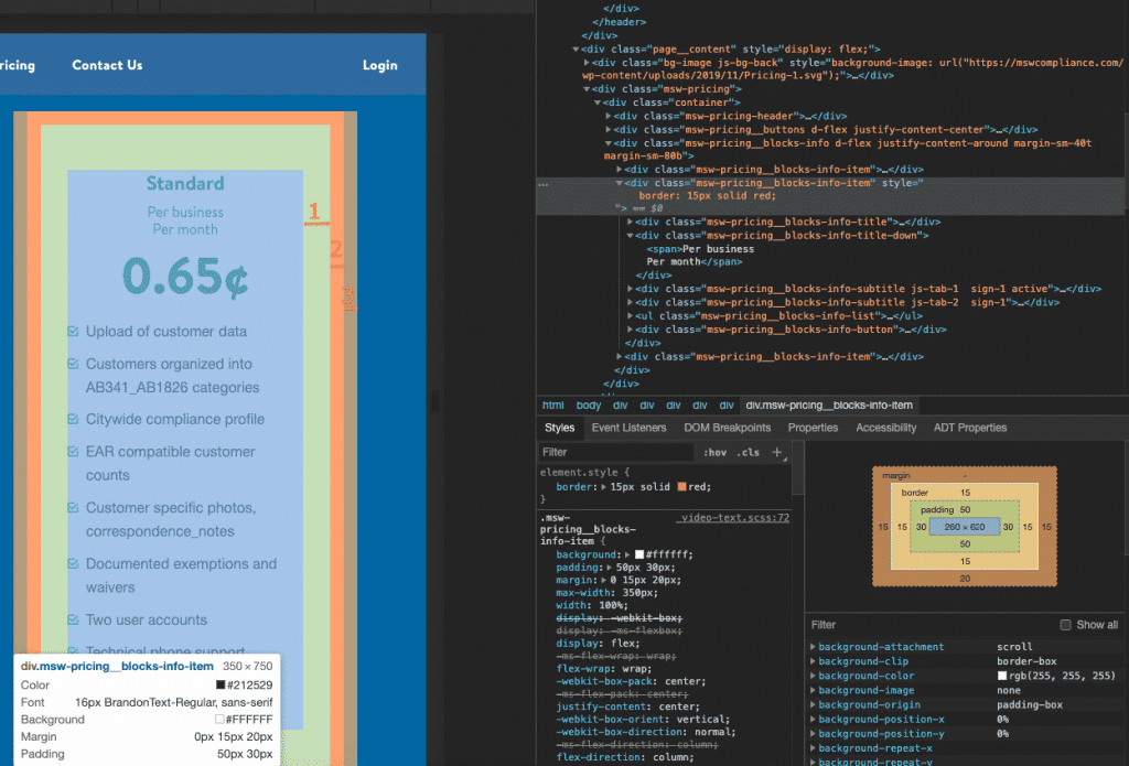
Top/bottom paddings should be indicated in the Style Guide as well for desktop, tablet and mobile view:
Padding or Margin
In CSS, the two properties that make spacing possible are padding and margin.
- The padding represents the inner space of an element
- The margin is external
In this example, padding and margin are shown around border:
1 – Padding
2 – Border
3 – Margin
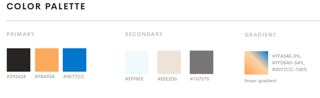
Color Palette
One of the quickest ways to wreck an interface is inconsistent color use, so color combinations need to be clearly defined. Listing colors and their values (HEX, UIColor) is a good start, but specific pairings and use examples should also be given.
Here are a few tips about color organization in a style guide:
- Provide color instructions in different codes: Hex, RGB, CMYK
- Specify different levels of opacity for each color
- Don’t forget about background colors
- Include text and link colors with clear use cases for each hue (e.g. light blue for links, burgundy for alerts).
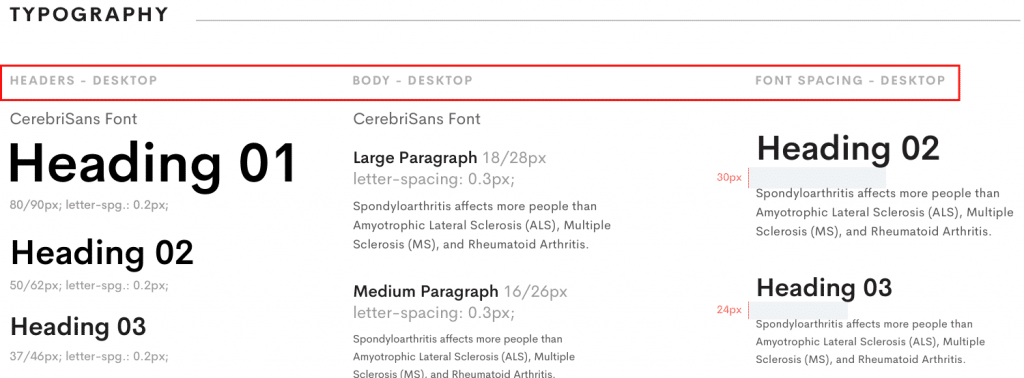
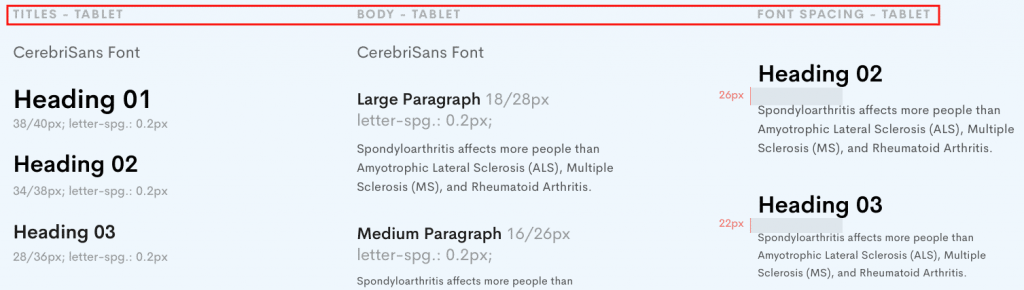
Typography Scheme
Typography is one of the most common interface design elements, so it’s not enough to merely list the names of typefaces used in a product. Clear instructions should be given for Titles, Subtitles, Headings (H1, H2, H3), Body Text, and Captions.
Additionally, font sizes should be provided, weights indicated, and styles defined. Line height and kerning are also needed.
Typography should be indicated for desktop, tablet and mobile design:
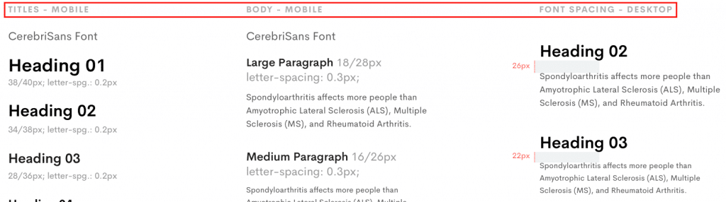
Headline styles and spaces between the elements (title + subtitle) can be indicated in the Style Guide if this is a case and will be different from project to project.
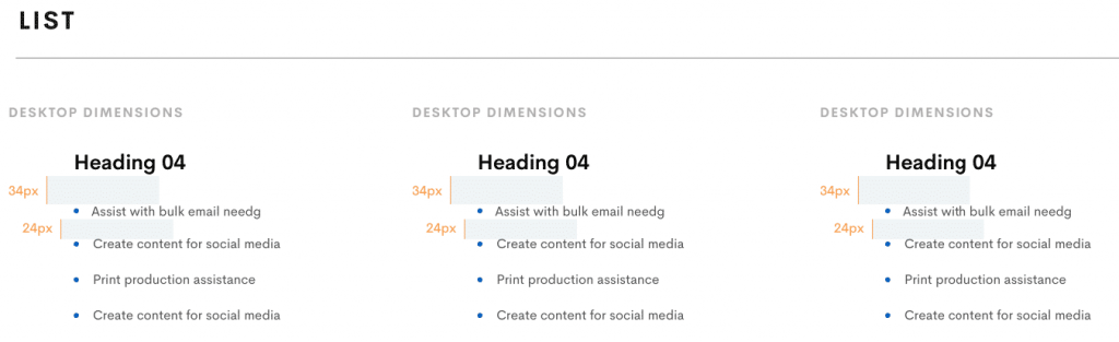
Example of spacings between title and list:
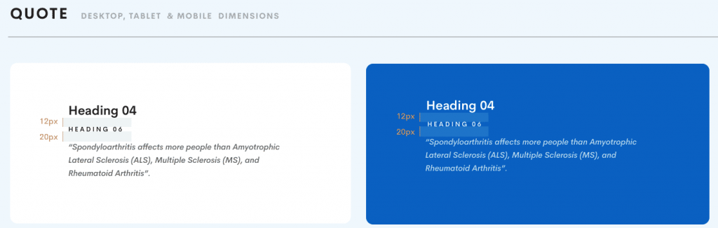
Example of spacings between title and subtitle:
UI Elements
At first it needs to be said that every product requires its individual elements. So, below there is a list of elements which may be used for different projects. The key is that all elements should be built upon previously defined typography, colours, spacing and iconography:
- navigation (main nav, secondary nav, breadcrumbs, pagination, …),
- buttons (primary/secondary action buttons, tools buttons, …),
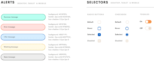
- alert messages (warnings, errors, information, validations, …),
- Tooltips and popovers
- Modals
- Datatables
- forms (fields, radio buttons, checkboxes, poplists, infield validation, on-off switches…),
- markers (person types markers, patient states markers, document types, …),
- additional elements (calendar, patient timeline, patients lists, documents lists, cards, modal panels, …).
- Content grid list
- Vertical lists
- Data and time picker
- Loading indicator
- Dropdowns
- Alerts
Let’s overview some of the UI Elements which are present in our Style Guide below: https://invis.io/HGVBCMQZXS8#/398303481_Style_Guide_
Icon set (iconography)
Icons in your projects will give an instant idea to visitors as to what’s going on and what will happen next. Picking the right icons will give more context to content than color palette, copy or graphics.
General rule for using icons in design:
- all icons shown together (that will help you with visual consistency),
- icons versions for light and dark backgrounds,
- unified range of sizes,
- predefined slicing areas for easier SVG exports.
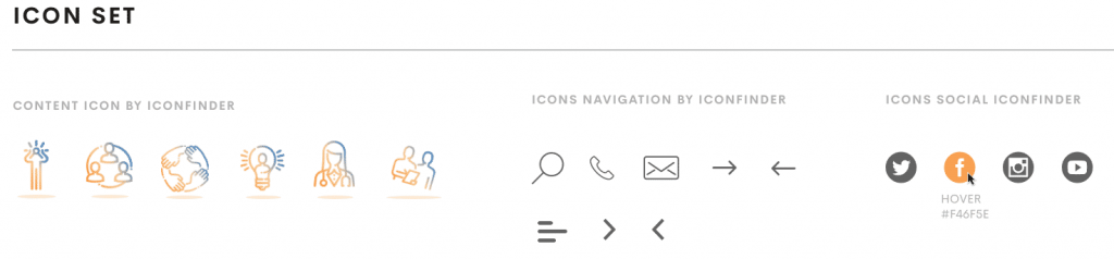
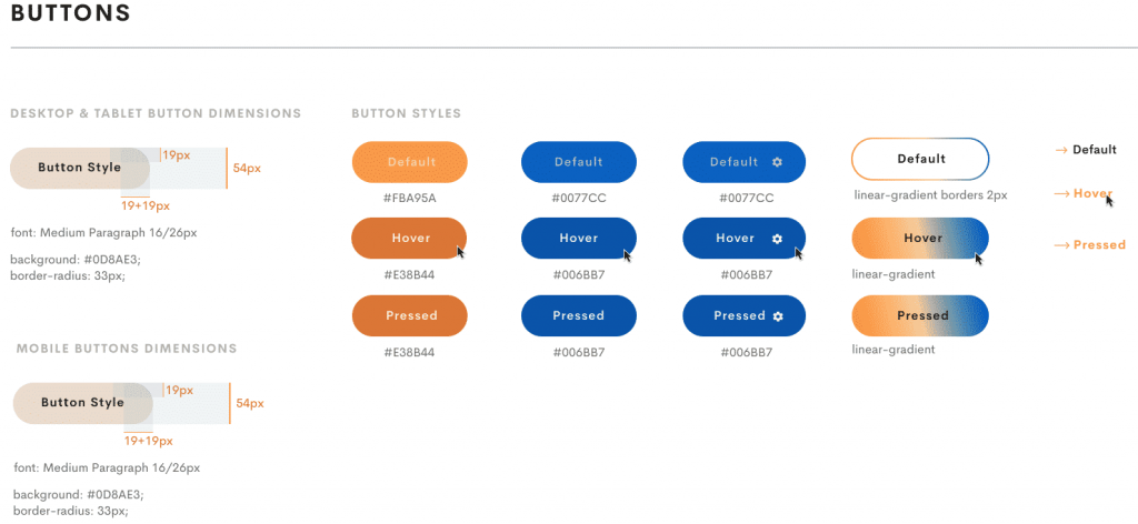
Buttons
Nearly every interface includes buttons, so take the time to document their sizes, styles, colors, placement, spacing, and typographic elements. If various buttons are used in different contexts, make that clear as well.
A best practice is to group the buttons into classes: primary and secondary or (default), reversed, outlined, with specific backgrounds or borders that can easily be translated into code.
When designing buttons, make sure you bring in front details like:
- Importance. Using a powerful color on primary buttons, gives a visual indicator leading the user to perform a desired action.
- States. There are a few states here, but you can stick just with normal and hover and most of the time you don’t need more than that.
- Indicate fonts, backgrounds, border radius for buttons.
- Emphasize details like shadows, icons.
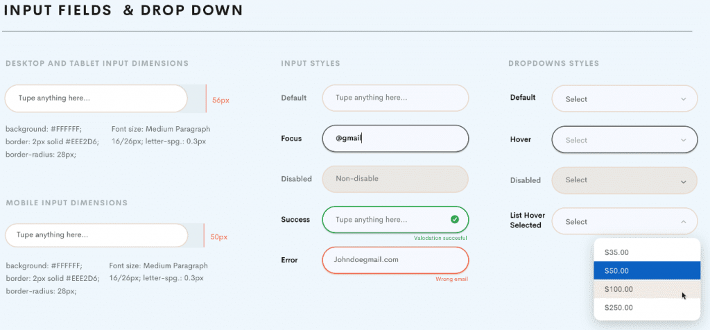
Input fields and dropdown, Selectors
Forms are what make your website or web app interactive and dynamic so the user can enter the data and you can then manipulate it and do the work.
Make sure to establish a hierarchy and include possible feedback from forms — active, hover, add error, warning and success messages including things such as a password being too weak, email being not valid or simple success messages e.g. “email was sent.”
Border, Border radius, font size, background color should be also indicated for all types of buttons and dropdowns.
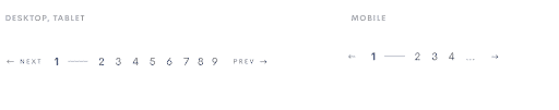
Pagination
Pagination is used for changing larger page content items. It can be shown in steps or without steps.
The step-based display shows all available and directly selectable pages or content items as well as the current position.
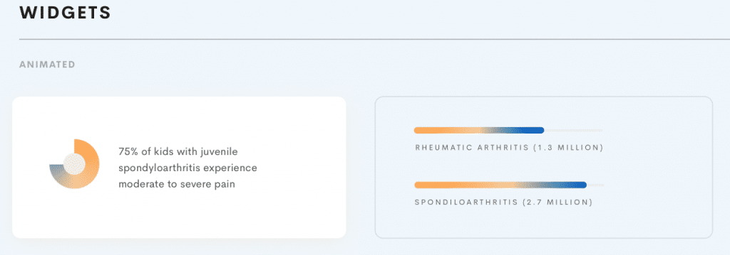
Widget
Depending on the projects we might have different widgets, progress bars and other animated elements included into the page structure.
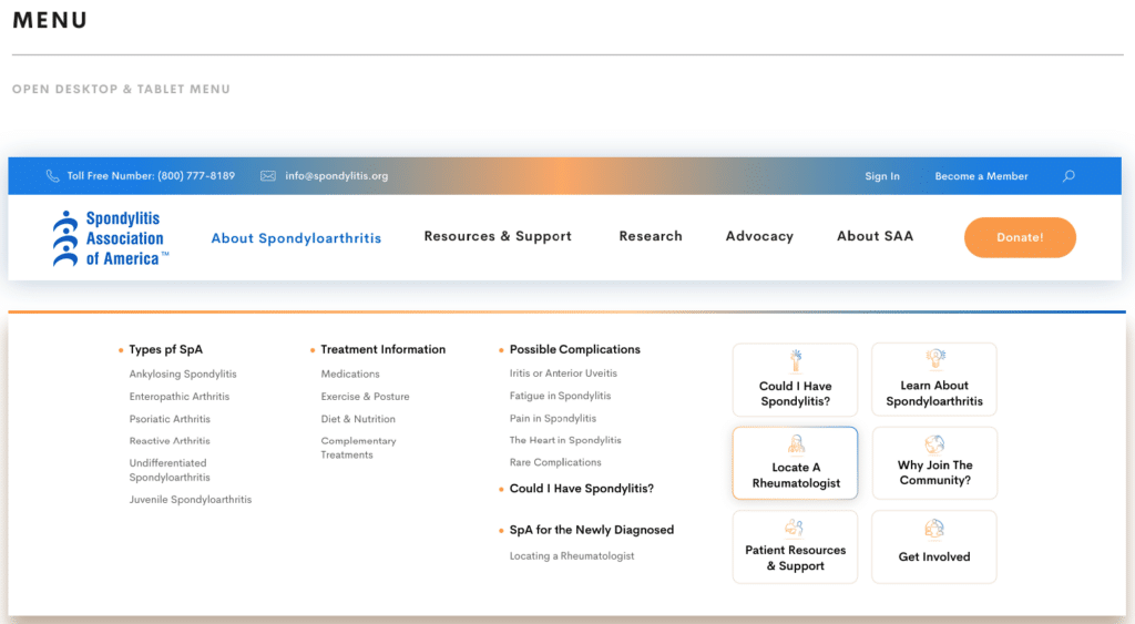
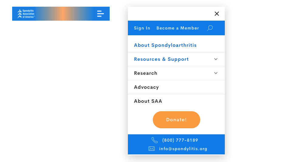
Menu (desktop/mobile)
For the menu part we need to have the desktop version, tablet version (usually is the same as for the desktop) and mobile version (burger menu) of all menu elements.